Web design trends are constantly changing, new styles appear, and some become obsolete and fade into the background. It is very difficult to keep track of all the news in this thread, so in this article I will review the popular website styles in web design, which, in my opinion, will be relevant for a long time.
Skeuomorphism – “retro” style in web design
It originated in the early 2000s and has become quite a popular trend. Just at this time, personal computers and smartphones began to rapidly enter the daily life of people. Apple representatives were among the first to use this concept in their products.
By adding shadows and lights, the buttons appear bulging and quite realistic. It’s the same with icons: highlights, specular reflection and shadows. Everything is like in the real world.
Why was skeuomorphism popular in design before?
First, because before, users were not at all experienced in the digital space. In order for the user to understand that there is a button in front of him that can be pressed, it was necessary to make the button look like a real one. And so in everything.
Secondly, at that time it was something “supernatural” and cool. That is, for new users, skeuomorphic interfaces seemed beautiful and impressive. You could spend hours admiring all these icons and buttons with highlights and shadows. The beauty of the interface was one of the main criteria for users of that time.
Why skeuomorphism is obsolete
Because over time, web design has taken the path of simplifying entities. Users became more and more experienced in the virtual world and there was no longer a need to imitate realistic objects.
Everyone has become accustomed to interface elements such as buttons, icons, forms, and so on. It was enough to draw a rectangle with text, and all users understood that there was a button in front of them.
User needs have also changed. We needed simple interfaces that loaded quickly. The downside of skeuomorphism was that it created a lot of visual noise in the form of shadows, highlights, and textures. This began to distract users and complicate the perception of the interface.
Thus, a new style in web design was born.
Metro – “underground” style in web design
Since there was a demand for simplified interfaces, there was also a proposal – the Metro style. The instigator was Microsoft, which decided to “refresh” its platforms with a new design. Initially, this style was developed with the aim of updating popular Windows operating systems. If my memory serves me, then I was the first to try on a new thing of Windows 8.
The philosophy of the Metro style was borrowed from the information interfaces of transport routes, the essence of which is based on high readability, easy perception of information and the absence of distractions. Actually, the name of the style hints at the “subway”.
The main principles of Metro:
- User focus on content
- The interface is the user’s guide to the desired functions
- Beauty shouldn’t come at the expense of convenience.
Microsoft themselves called the Metro style “Our new design language”, which means “our new design language”. For all this, even a unique font was developed – Segoe. The emphasis was on readability even at small sizes.
Over time, the Metro style migrated from the Windows operating system to the web space, where it found its followers. By the way, it was Metro that became the “trend starter” of today’s popular minimalist styles, Material and Flat design.
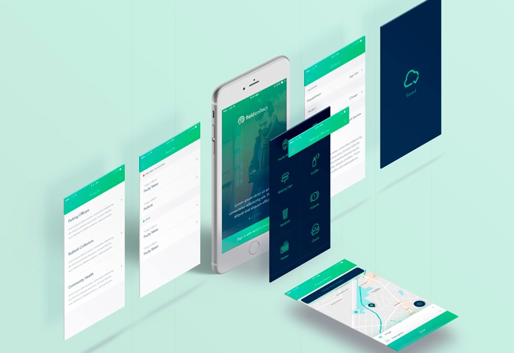
Flat design is a new generation style in web design
Flat design is the exact opposite of the skeuomorphism style. It was born around 2012 and its main feature was the creation of “flat” design elements without highlights, shadows and textures.
Unlike Metro, the Flat style was immediately applied to the web space, and since Metro was already quite a popular trend at that time, Flat immediately became a popular style. By the way, it is still popular in user interfaces to this day.
All this movement was picked up by Google and rolled out its own style called Material.
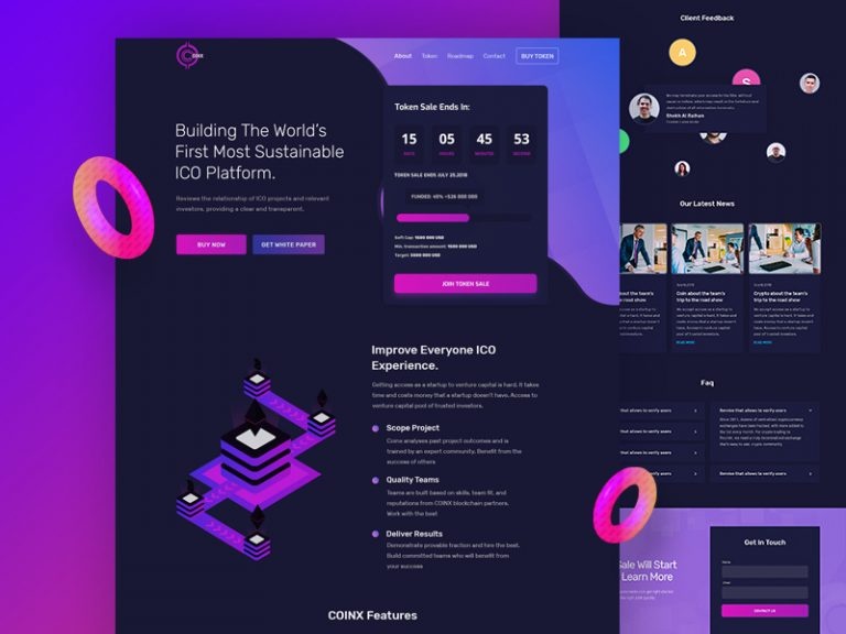
Material is a popular style in web design.
Material is a cross between skeuomorphism and Flat style. It uses flat UI elements, but some of them may cast a shadow. That is, the only thing left of skeuomorphism is a shadow, everything else is a flat design.
Material is used in all Google products and Android mobile platforms. In addition, it is also readily used on third-party projects.
Material gained its popularity due to its guidelines. To date, material design guidelines are the most convenient and understandable design documentation. Even Apple can’t boast such detailed design systems.
In general, there is already a very thin line between modern styles in the form of Metro, Flat and Material, because flat design is used everywhere. Therefore, we came to a unifying style called minimalism.