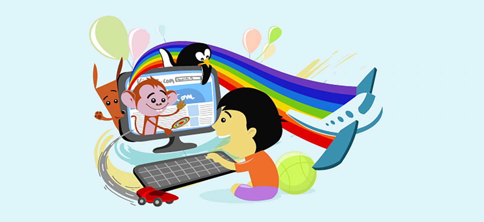
The Internet is developing rapidly, the number of created sites is increasing every day. Trade also moves here, serious competition arises. This means that web design begins to play an important role in promoting sites, their products and services. Web design has its own rules and peculiarities.
First of all, this is a competent logical structure of the site, convenient page layout, clear navigation through the resource. The speed of opening pages and a simple navigation bar are pleasant for any visitor. And if they still have a beautiful geometric and color design concept, the client will stay for a long time.
There are several types of web design:
text design, where more attention is paid to the content, and images play a decorative role. Print design is a kind of imitation of printed publications, where pixel graphics are more often used. Interface design or usability – careful care for the visitor, maximum image optimization. Dynamic design is a true, well-thought-out artistic image that represents the author’s intent. Mixed design is a combination of several types of web design.
Things to keep in mind when designing
In the presence of textual information and visual graphics, a balance is important. The text should be easy to read, and the graphics do not always contribute to this.
A very large number of graphics greatly interferes, even annoys, especially when there is no harmony between color and geometry.
Beautiful graphics, color should help reinforce information, remember it. Graphics for the sake of beauty is useless – not all buyers want to admire the pictures for their money, they need a product, service, information. It takes a lot of time to open pages with an abundance of graphics.
Bottom line: web-graphics should be functional, logically justified, of course, exclusive, combine static and dynamic components.
Web design nuances
These include navigation button styling, the presence of a logo, list bullets, masthead or title graphics, text separation lines, background graphics, title graphics, and photo images.
Each of the listed graphic solutions should be in accordance and in harmony with the color scheme of the site, various visual effects and fonts. All graphic images should become auxiliary functions related to the content and theme of the site.
Web design styles
The Beautiful Typography style is a cross between newspaper and cartoon style, or rather, combines them in itself. However, the differences are very significant. So, unlike the newspaper style, the typographic style implies the use of bright and non-standard fonts, but, unlike the drawn one, the main emphasis in it is not on the graphic, but on the text context. Thus, this style is ideal not only for creating personal business card websites, but also for designing landing and promo pages, online stores and even corporate websites.
Responsive style
Responsive style or adaptive style emerged as a result of technological progress. Since a large number of devices have appeared with which you can view sites, it became necessary to find a style that would allow the site to look equally organic both on a smartphone or tablet, and on a desktop computer or laptop. The main distinguishing feature of the adaptive style is that the design of the site begins with a version for mobile devices.
The high-tech style originated in the 1970s in architecture, however, it began to be used in interior design only a decade later. With the development of modern technologies, this style was not limited only to real space, but also quite organically merged into the field of web design. The main distinguishing feature of this style, which makes it somewhat similar to minimalism but significantly differs from the industrial style and futurism, is the almost complete absence of any decorative elements, since beauty was sacrificed for the sake of functionality.
The Metro style
The Metro style was introduced by Microsoft in 2010 and has not lost its relevance since then, because its minimalism and, at the same time, a wide color palette and original typography leave enough room for even the most daring ideas to come true. What’s more, because this style is based on the concept of responsiveness, Metro-style pages look equally good on any device, from desktops and laptops to smartphones and tablets.
When talking about Apple’s style, many customers mean the company’s website. At the same time, it is very important to distinguish between the desire to do “the same” or, in other words, just copy the site, and the re-creation of a common concept, which is based on high quality, minimalism and a strict hierarchy in the issue of placing information blocks. And, if in the first case the site, oddly enough, turns out to be rather boring and does not stand out among millions of its kind, then in the second it is an absolutely unique page that every visitor will surely remember.
Flat or flat style appeared in 2012 and replaced skeuomorphism with its realism and volume, introducing minimalism and two-dimensionality instead. Despite this, this style is by no means boring or mundane, as the widespread use of interesting and unusual typography, bright colors, large images and even videos allows you to create unique projects and successfully implement complex tasks.